Netflix Business Economics and Forecasting Dashboard
Academic
Live project: https://netflix-business-analysis.streamlit.app/
Code on GitHub: https://github.com/theCosmicNoise/mgta-452-netflix-analysis
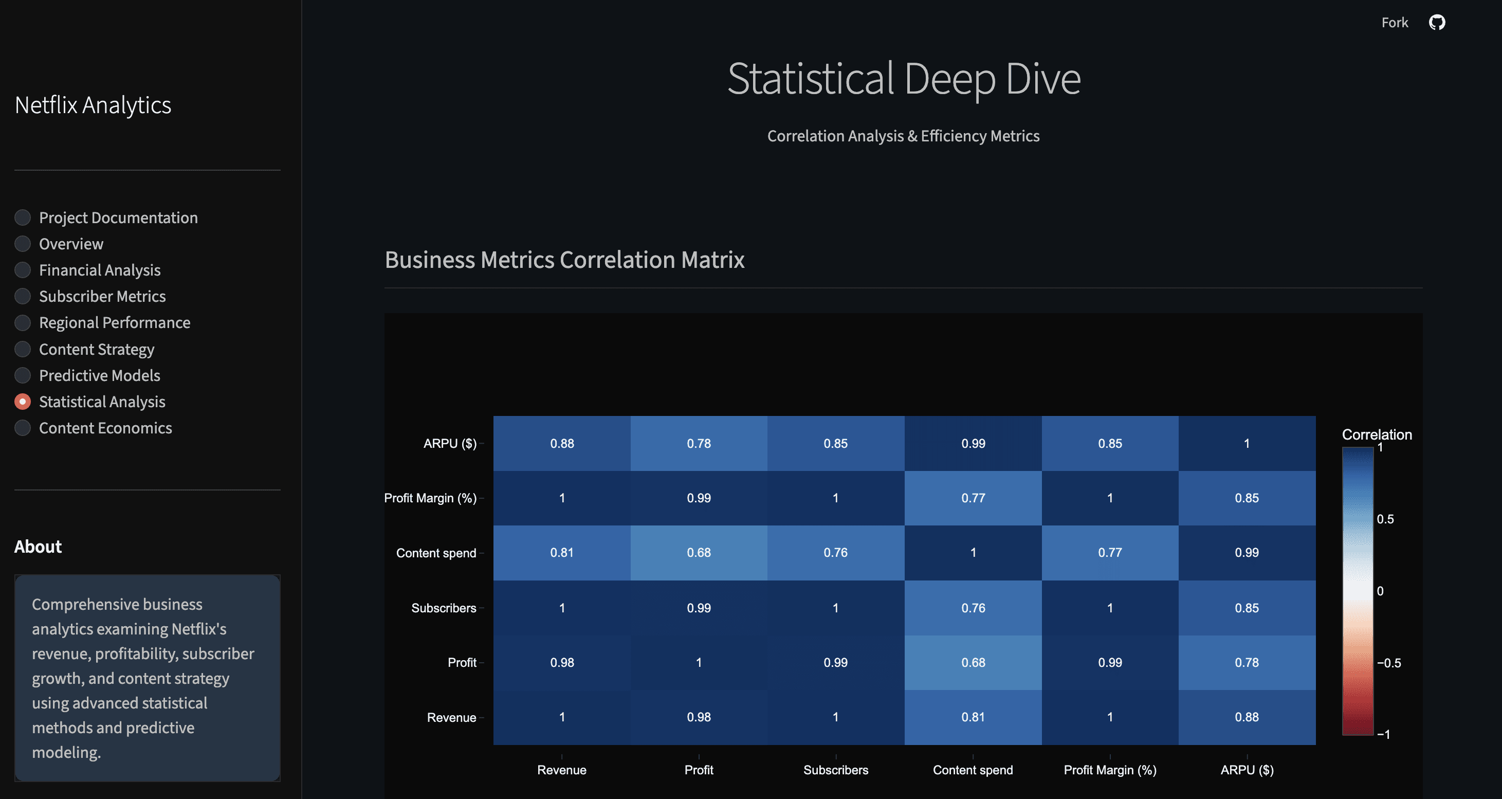
I built an interactive analytics dashboard in Python using Streamlit that brings together financial, subscriber and regional performance data for Netflix. The goal was to understand how key business drivers like revenue, content spend and subscriber growth vary across markets, and how these patterns can shape forecasting and strategic priorities.
What this project does
Surfaces high-level trends in Netflix’s revenue, profitability and content investment over time.
Breaks down subscriber growth and revenue by region to highlight where engagement and monetization are strongest.
Visualizes relationships between content economics (for example, production budgets versus returns) and broader business outcomes.
Includes forecasting scenarios based on historical data to support planning and analysis.
Presents interactive, filterable charts and metrics to help explore insights without writing code.
The dashboard was designed to make complex business data easy to explore, enabling clearer conversations about growth opportunities and tradeoffs across different markets and metrics.
Why it matters
This project blends quantitative analysis with business context — it doesn’t just show numbers, it helps answer questions like:
Which regions are driving Netflix’s subscriber momentum?
How does content spending relate to profitability over time?
What do recent trends imply about future revenue or subscriber trajectories?
These kinds of insights are useful for product and strategy discussions, especially when deciding where to focus next.
Tech stack & approach
Python for data processing and analysis
Pandas and NumPy for data manipulation
Plotly for interactive visualizations
Streamlit to turn scripts into a shareable analytics app
Modular code structure from the GitHub repository makes it easy to maintain and extend
The dashboard also serves as the final project for the MGTA 452: Collecting and Analyzing Large Data course at the Rady School of Management.