©2026, Anjali Roy
©2026, Anjali Roy
Viztara: AI Tableau Dashboard Explainer
Data Visualization
A product breakdown, including the case against it
Click here to access the link!
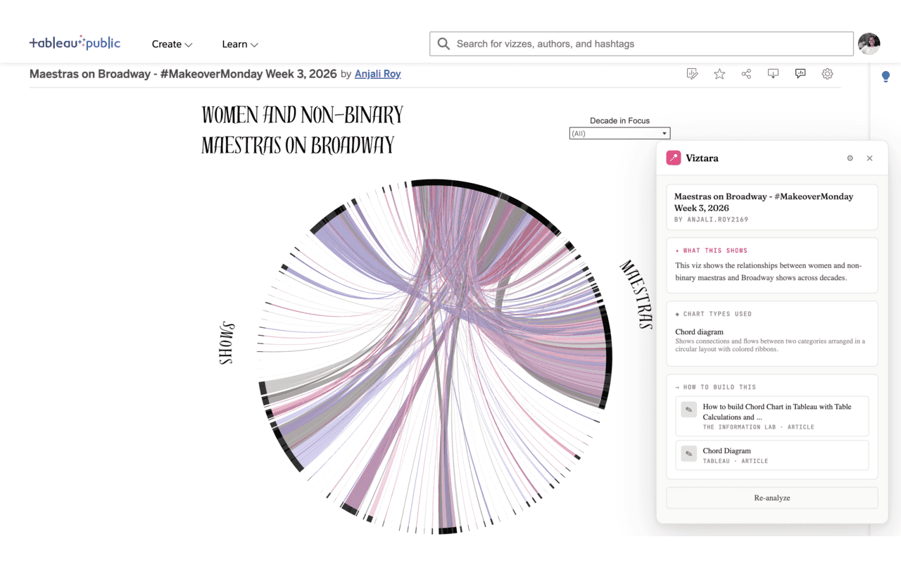
I recently shipped a Chrome extension called Viztara. It runs on visualization pages on Tableau Public, and clicking its button passes the visualization to an LLM, which returns a plain-language summary of what the viz shows, identifies the chart types it uses, and links to tutorials for building each one. That is the full scope of the product.
I want to break it down the way I would assess any product decision, because the interesting part is not the build. It is whether a problem this small was worth solving, where the design holds up, and where it does not.
The problem, stated precisely
The task Viztara addresses already has a working manual solution. Someone learning visualization who finds an unfamiliar chart on Tableau Public will usually screenshot it, open an LLM in a separate tab, paste the image, and ask how it was built. That sequence works, so Viztara is not solving an unmet need. It is compressing a known sequence into a single click on the page the user is already viewing.
This matters for how the product should be judged. The friction it removes is small and specific: one screenshot, one tab switch, one prompt, on the order of 20 to 30 seconds. Any honest evaluation has to start from the fact that the baseline is not pain. It is mild inconvenience.
Why I chose this friction rather than another
I did not pick the problem because it was large. I picked it because of where the value concentrates in self-taught visualization.
The binding constraint when you teach yourself this skill is not effort or motivation. It is vocabulary. You cannot search for how to build a technique when you do not know the technique has a name, and a lot of modern dataviz uses chart types a beginner has never heard of. The people who removed that constraint for me did it by naming things and explaining them: the Flerlage Twins, Playfair Data, The Data School, The Information Lab, VizWiz, alongside Tableau's own documentation.
So the function that actually carries Viztara is not the summary and not the time saved. It is the step from "I am looking at something I cannot name" to "here is the term, and here are the tutorials that explain it." The time saved is incidental. The naming is the point.
The case against the product
A fair breakdown has to include the arguments I cannot dismiss.
First, this is a vitamin rather than a painkiller. No one's work is blocked by its absence, which means it competes for adoption against indifference rather than against a problem people are actively trying to solve. That is a high bar, because a tool that saves 20 to 30 seconds only matters if someone changes their habits to use it, and small conveniences rarely clear the threshold required to change a habit.
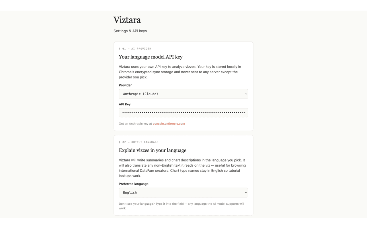
Second, the cost model contradicts the audience. Viztara is free to install, but each analysis runs on the user's own Anthropic or OpenAI key and costs a few cents. The intended users are students and curious beginners, and asking that group to create an API account, generate a key, and accept an ongoing per-use cost introduces more setup friction than the 20 to 30 seconds the product was built to remove. I cannot argue that away. It is a real tension in the design.
Third, the audience narrows multiplicatively. The user has to be on Tableau Public, has to want to learn rather than just look, and has to be comfortable setting up an API key. Each filter is individually reasonable. Applied together, they reduce the addressable group to something quite small.
Why the small friction can still be worth removing
The counterargument I find defensible is about frequency rather than seconds.
Friction does not only tax each instance of a task. It suppresses how often the task happens at all. When learning from a viz requires a screenshot, a tab switch, and a prompt, people do it occasionally, when they are already motivated. When it requires one click on the page in front of them, the cost of acting drops below the cost of curiosity, and the action happens more often. For a learning tool, frequency is what compounds into skill, so the change worth measuring is not time per use but how often a user engages at all.
I will state that as a hypothesis rather than a result, because I have not validated it: if lowering activation energy is the real mechanism, repeat use per installed user should rise over time rather than stay flat. That is the number I would want to track.
The decisions I would defend
Three choices were deliberate and I would make them again.
Requiring users to bring their own key is the main adoption barrier, but it is also the reason I can make a privacy claim that most free tools cannot. API calls go directly from the browser to the provider, keys are stored in the browser's encrypted storage, there are no accounts or telemetry, and the code is open source. I traded easy adoption for a guarantee I can actually stand behind. That trade is correct for the user who cares about it and wrong for everyone who does not, and I accepted that narrowing knowingly rather than by accident.
Output works in 19 languages. The marginal cost of adding them was low, and most visualization learning resources are English-first, so the languages widen who the product can serve without expanding what it does. Of the decisions here, this is the one whose value relative to its cost I think is highest.
Identifying 30+ chart types includes the ones beginners genuinely cannot name, such as beeswarms, sankeys, calendar heatmaps, slope charts, and small multiples. Naming a bar chart adds nothing. The value sits almost entirely in identifying the charts a learner would never know to search for, which is why coverage of the unusual types mattered more than polish on the common ones.
The constraint that actually decides this
The weakness that matters most is not in the feature set. A single person can build something useful and still have no route to the few thousand people for whom it is useful. Building the extension was the straightforward part. Reaching the specific audience is the unresolved part, and it is the variable that determines whether any of the above mattered. The product question I underweighted was distribution, and naming that clearly is more useful to me than defending the build.
What the exercise was for
The skill I was practicing was not building a Chrome extension. It was deciding whether a small problem is worth solving, being precise about who the product is not for, separating the choices I can defend from the ones I cannot, and identifying the constraint that actually governs the outcome. Viztara may stay small, and that is an acceptable result. The reasoning is the part I wanted to get right.
If you build for the Tableau community, or you have reasoned your way into building something with no obvious need, I would be interested in how you thought about it.
Viztara is free and open source, available on the Chrome Web Store and on GitHub.
A product breakdown, including the case against it
Click here to access the link!
I recently shipped a Chrome extension called Viztara. It runs on visualization pages on Tableau Public, and clicking its button passes the visualization to an LLM, which returns a plain-language summary of what the viz shows, identifies the chart types it uses, and links to tutorials for building each one. That is the full scope of the product.
I want to break it down the way I would assess any product decision, because the interesting part is not the build. It is whether a problem this small was worth solving, where the design holds up, and where it does not.
The problem, stated precisely
The task Viztara addresses already has a working manual solution. Someone learning visualization who finds an unfamiliar chart on Tableau Public will usually screenshot it, open an LLM in a separate tab, paste the image, and ask how it was built. That sequence works, so Viztara is not solving an unmet need. It is compressing a known sequence into a single click on the page the user is already viewing.
This matters for how the product should be judged. The friction it removes is small and specific: one screenshot, one tab switch, one prompt, on the order of 20 to 30 seconds. Any honest evaluation has to start from the fact that the baseline is not pain. It is mild inconvenience.
Why I chose this friction rather than another
I did not pick the problem because it was large. I picked it because of where the value concentrates in self-taught visualization.
The binding constraint when you teach yourself this skill is not effort or motivation. It is vocabulary. You cannot search for how to build a technique when you do not know the technique has a name, and a lot of modern dataviz uses chart types a beginner has never heard of. The people who removed that constraint for me did it by naming things and explaining them: the Flerlage Twins, Playfair Data, The Data School, The Information Lab, VizWiz, alongside Tableau's own documentation.
So the function that actually carries Viztara is not the summary and not the time saved. It is the step from "I am looking at something I cannot name" to "here is the term, and here are the tutorials that explain it." The time saved is incidental. The naming is the point.
The case against the product
A fair breakdown has to include the arguments I cannot dismiss.
First, this is a vitamin rather than a painkiller. No one's work is blocked by its absence, which means it competes for adoption against indifference rather than against a problem people are actively trying to solve. That is a high bar, because a tool that saves 20 to 30 seconds only matters if someone changes their habits to use it, and small conveniences rarely clear the threshold required to change a habit.
Second, the cost model contradicts the audience. Viztara is free to install, but each analysis runs on the user's own Anthropic or OpenAI key and costs a few cents. The intended users are students and curious beginners, and asking that group to create an API account, generate a key, and accept an ongoing per-use cost introduces more setup friction than the 20 to 30 seconds the product was built to remove. I cannot argue that away. It is a real tension in the design.
Third, the audience narrows multiplicatively. The user has to be on Tableau Public, has to want to learn rather than just look, and has to be comfortable setting up an API key. Each filter is individually reasonable. Applied together, they reduce the addressable group to something quite small.
Why the small friction can still be worth removing
The counterargument I find defensible is about frequency rather than seconds.
Friction does not only tax each instance of a task. It suppresses how often the task happens at all. When learning from a viz requires a screenshot, a tab switch, and a prompt, people do it occasionally, when they are already motivated. When it requires one click on the page in front of them, the cost of acting drops below the cost of curiosity, and the action happens more often. For a learning tool, frequency is what compounds into skill, so the change worth measuring is not time per use but how often a user engages at all.
I will state that as a hypothesis rather than a result, because I have not validated it: if lowering activation energy is the real mechanism, repeat use per installed user should rise over time rather than stay flat. That is the number I would want to track.
The decisions I would defend
Three choices were deliberate and I would make them again.
Requiring users to bring their own key is the main adoption barrier, but it is also the reason I can make a privacy claim that most free tools cannot. API calls go directly from the browser to the provider, keys are stored in the browser's encrypted storage, there are no accounts or telemetry, and the code is open source. I traded easy adoption for a guarantee I can actually stand behind. That trade is correct for the user who cares about it and wrong for everyone who does not, and I accepted that narrowing knowingly rather than by accident.
Output works in 19 languages. The marginal cost of adding them was low, and most visualization learning resources are English-first, so the languages widen who the product can serve without expanding what it does. Of the decisions here, this is the one whose value relative to its cost I think is highest.
Identifying 30+ chart types includes the ones beginners genuinely cannot name, such as beeswarms, sankeys, calendar heatmaps, slope charts, and small multiples. Naming a bar chart adds nothing. The value sits almost entirely in identifying the charts a learner would never know to search for, which is why coverage of the unusual types mattered more than polish on the common ones.
The constraint that actually decides this
The weakness that matters most is not in the feature set. A single person can build something useful and still have no route to the few thousand people for whom it is useful. Building the extension was the straightforward part. Reaching the specific audience is the unresolved part, and it is the variable that determines whether any of the above mattered. The product question I underweighted was distribution, and naming that clearly is more useful to me than defending the build.
What the exercise was for
The skill I was practicing was not building a Chrome extension. It was deciding whether a small problem is worth solving, being precise about who the product is not for, separating the choices I can defend from the ones I cannot, and identifying the constraint that actually governs the outcome. Viztara may stay small, and that is an acceptable result. The reasoning is the part I wanted to get right.
If you build for the Tableau community, or you have reasoned your way into building something with no obvious need, I would be interested in how you thought about it.
Viztara is free and open source, available on the Chrome Web Store and on GitHub.